
Logomarks & Icons
Click on any of the Logos below to learn more...


The Express Newark logo mark is composed of one logo mark but changes when it takes on different levels of services through the Express Newark facility. Each floor has a different look and use of color.
A black and white, and a wire frame logo mark was then also created to fulfill the technological needs of the 21 century, such as fax machines, black and white copiers, and stamps.


OLD LOGOMARK

NEW LOGOMARK
The re-branding of FEMWORKS consisted of many important key factors. When redesigning the company logo we kept in mind the fundamental pillars of the multi diverse consultation firm. Bringing female empowerment history through the color palette and double meaning with the reflection of the letter "M" creating "W".
The Logo is composed of the "two in one theory", the logo mark and the icon formulates in the "M" and "W".
This Icon is used for many other purposes such as the icon app, and business card icons.


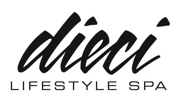
Dieci companies is composed of three different store fronts, each tailoring to a different clientele. Being a luxury hair salon and spa for both male and female, the owners wanted the logo to reflect not only the clients but also the products. After choosing a font that was made from lipstick script, a clean - up services was made to the font.
All three companies now have the same script logos and address all the clients needs.


Blue Force Communications is a global public affairs, public relations, strategic communication, and geopolitical consulting agency. Client decided to re-brand the company logo. Clients parameters where to keep the same type but needed the logo to be more bold and not light.
Adjusting the gaps in the font (closing the "B" and "R"), while strengthening the lower font, and adjusting the value in the existing colors, the new Blue Force Communications logo tailors to all the client's needs.

Hip New Jersey needed a sister logo mark for one of its political news channel. They wanted to keep the same visual language as the main logo mark while adding more illustrative representation.
Designing the "Cast your Vote" logo mark needed to speak to the New Jersey Market, while enforcing the brand image and relationship between Hip NJ and its clients.


Casa Colombo has been around since 1936, with almost 100 years of providing Italian Educational service the organization has had different brand representations. The Last Logo was designed in 2000, the new logo has a sans serif typeface with two simple sails as the company icon. Casa Colombo hosts the organization IECC (Italian Educational and Cultural Center) Different versions have been designed to fit different social media pages such as Facebook and Twitter.


OLD LOGOMARK
NEW LOGOMARK
Halos for Angels, Inc is a non profit organization that was founded in 2010. The original logo spoke to the mission statement " helping families in need, what color is your halo" but was grainy and organic in design. The new logo has a clean crisp typeface, and an icon that can be utilized in many different ways - please see HFA for Icon use in press kit.